Use Image when you need more control than basic Markdown image syntax. It supports visible captions, dark mode image variants, click-to-zoom, width constraints, and alignment.

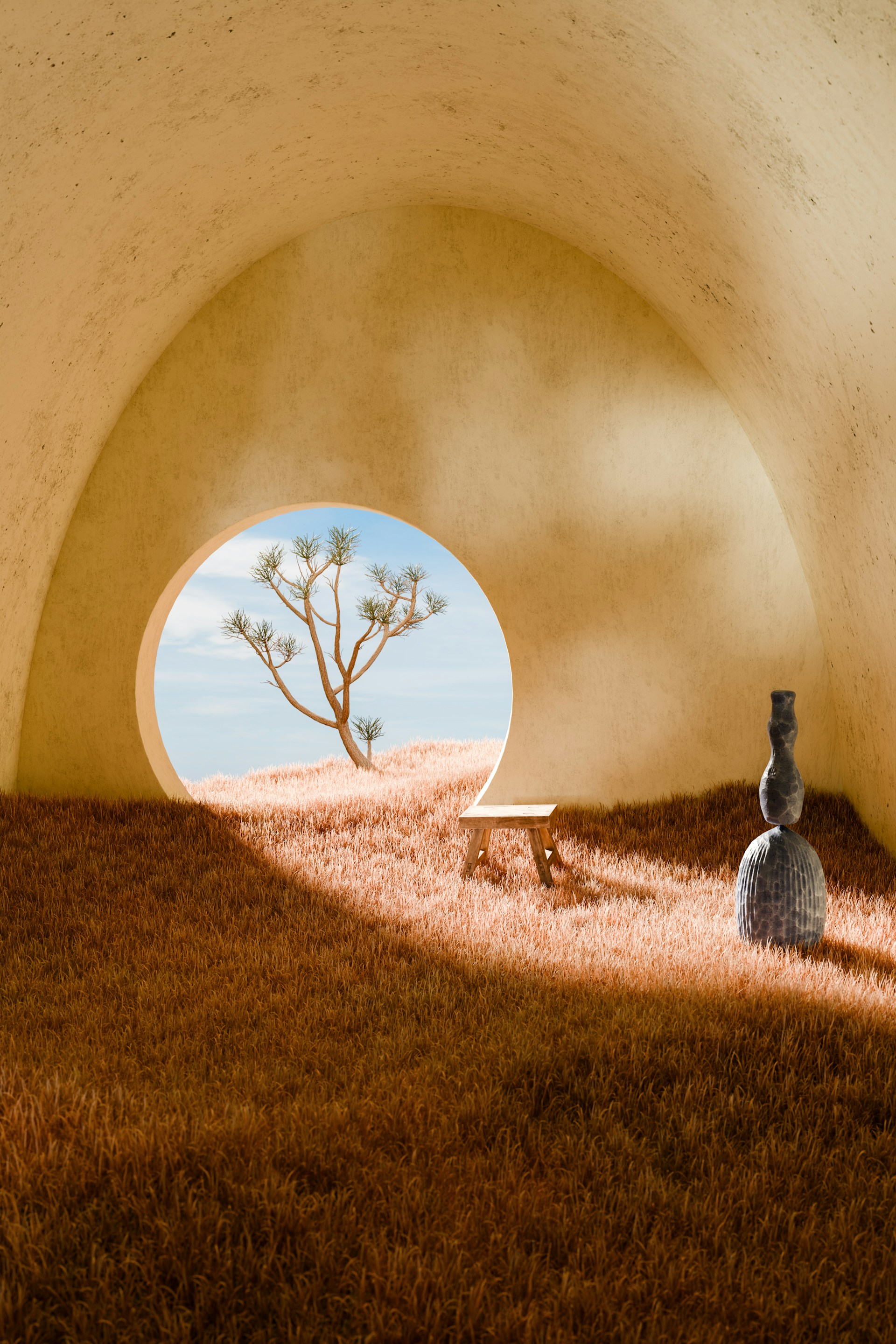
Photo by Nico Knaack on Unsplash

Basic usage
Provide src and alt
src is required. Always include meaningful alt text for accessibility.
Add a caption
Add caption content as the children of the Image component. Caption content supports Markdown.
Photo by Nico Knaack.
Use title only when you want a browser tooltip/title attribute on the image. It does not render a visible caption.
Dark mode images
Use the object form of src when the image itself should change between light and dark mode. The light source is required, and dark is optional.


This image uses a different source in dark mode.
Light mode photo by Marek Piwnicki on Unsplash.

Control size and behavior
Constrain width
Pass width in pixels to keep large images from taking too much space.

A constrained image can sit comfortably inside a wider page.
Photo by Mehrab Sium on Unsplash
Align a constrained image
Use align to position an image that is narrower than the content column.
Supported values are left, center, and right. Images are centered by
default.
Disable click-to-zoom
Set zoom={false} when you want the image to remain static.
This image does not open the zoom overlay.
Props
| Prop | Description | Type | Default |
|---|---|---|---|
src | Image source path or URL. Use object form for light and dark mode variants. | string or{ light?: string; dark?: string } | |
alt | Alternative text for accessibility. | string | |
title | Browser tooltip/title attribute. This is not a visible caption. | string | |
width | Max rendered width in pixels. | number or string | |
align | Alignment for constrained-width images. | "left", "center", or "right" | "center" |
zoom | Enables click-to-zoom overlay behavior. | boolean | true |
| children | Optional visible caption content. Supports Markdown. | Markdown |
Supported Props Only
Image only supports src, alt, title, width, align, and zoom. Use children for the optional caption.
Unsupported props will throw a user-facing validation error.